
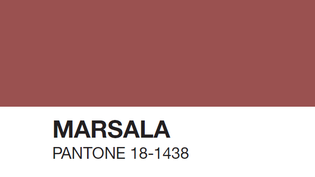
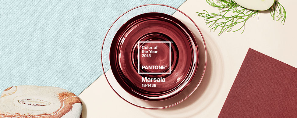
Marsala 18-1438 is the new Pantone colour of the year for 2015. The colour is reminiscent of rich pomegranate tones which psychologically brings nostalgia, independence and elegance to our minds, but in my personal and humble opinion this choice is rather boring, unmemorable and feels rather old for the challenging time we are living in. Well I guess the deep warm red is alright for the holiday season at least.
This is what I call a transitional colour. Yes, the value of the colour has more general appeal than “Radiant Orchid”, the Pantone colour for last year, which was a hard sell. But I believe this time it is obvious that Pantone took the easy way out – as if to say “let’s make sales!”. At the end of the day, any section of the design industry is moved by this decision. I think it is the perfect colour for the make-up industry. It will pair beautifully with any skin tone, but for my particular industries (interior design and graphic design), it feels completely out of date with current design directions.
I believe that my circle of friends are looking for happiness, something that brings people together and joy in their lives. Marsala feels rather independent and recessive to invite other colour combinations. It is a colour that makes me think I want to be alone with my iphone browsing instagram, rather than spending time with family and friends. Obviously, if you play with the colour wheel you can use golds, oranges, turquoises and other colour combos to complement it, and create interesting pairings. But my question is, is this the sentiment we want and need right now?
If you want to learn more about Marsala please click the link below
Marsala Pantone of the Year 2015
Comments
2 Responses to “Marsala Pantone of the Year”
I totally agree with you, Ivan, about the shade marsala. It doesn’t feel hopeful or engaged, and in my opinion, it is completely without whimsy or gaiety. I look to the Pantone colour of the year to add a spark to timeless classics, but think I’ll be taking a pass on this one…