In response to Ivan’s previous post, a review of Marsala: Pantone’s colour of the year for 2015, I thought I would round-up what some of the top paint companies have come up with for their colour of the year to see how they stack up:
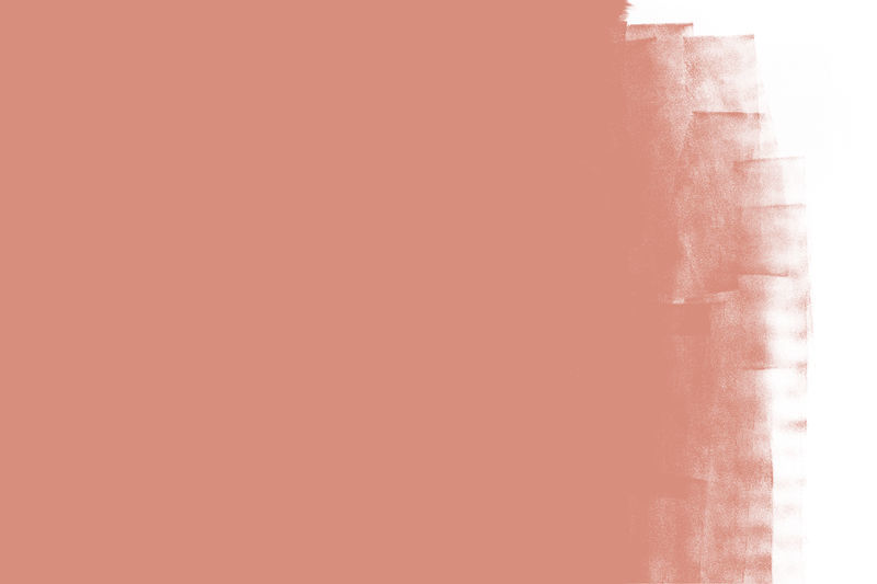
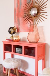
One of my Personal favourites is the selection made by Sherwin Williams: Coral Reef. In contrast to Ivan’s review about Marsala, this similar tone is more happy, but maintains the vintage/hipster-friendly appeal which remains popular in design. Coral is always on my radar but I am really gravitating towards this new variation (plus, as a fashion colour, it really brings out my blue/green eyes!). This is the perfect pop of colour to accent a space.
SW 6606 : Coral Reef
The same could be said for Dulux’s Colour of the year: Copper Blush. If at all possible, I think I may even love it more! Don’t get me wrong, I think both have their place in design, but I think Copper Blush is definitely more liveable. I love how this slightly neutralized shade brings coral into 2015 from it’s flashier incarnations of years past (and Sherwinn Williams choice), by exuding sophisticated femininity.
Dulux : Copper Blush
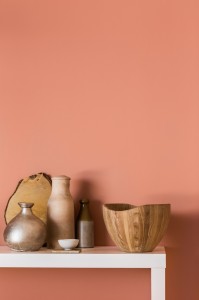 image via beautifulkitchensblog.co.uk
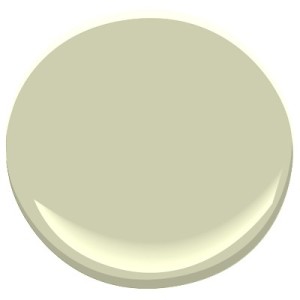
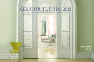
At the other end of the spectrum (literally, the complete opposite), Benjamin Moore has selected Guilford Green as their 2015 Colour of the Year. It’s soft and minty, which like it’s coral counterparts, hits the mark for appealing to the ever-growing hipster population. Although it comes from one of my favourite palettes, Benjamin Moore’s Historical Collection; personally, it’s not my favourite. But in all fairness, green never is for me. I find the soft yet vibrant colour could be a little difficult when trying to get it to play nicely with others, but a little boring on it’s own. That being said, it would work in a complementary colour scheme applications with Dulux, Sherwin Williams and Pantone’s selections in small doses as shown in Benjamin Moore’s imagery.
HC-116 : Guilford Green
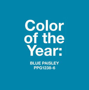
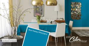
Lastly, Pittsburgh Paints has chosen their Blue Paisley, a bold peacock blue. It can be either a great pop of colour in a modern space against a crisp white; or, a beautifully upholstered piece in a traditional one – I’m picturing rich velvets amongst droopy white tulips, dainty golden tables and rich tapestries – and tassels of course.
Blue Paisley : PPG1238-6
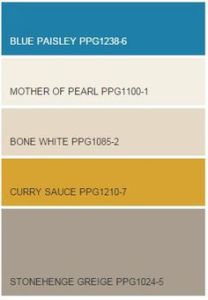
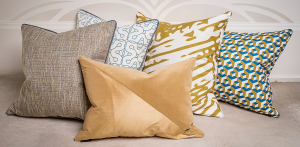
Obviously, we agree with their palette choice here at Meade Design Group, it’s as if they chose their palette right out of our principal Ivan Meade’s fabric line! Consider him flattered – or, a great trend predictor, he’d be happy with either!
Pittsburgh Paint Colour Trends for 2015
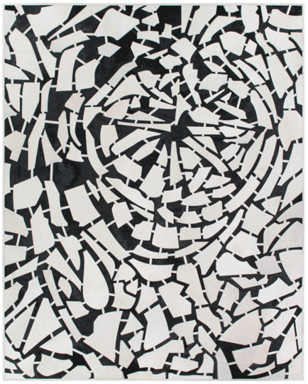
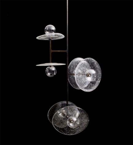
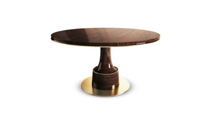
See the resemblance?
Other companies such as Pratt &Lambert, Farrow & Ball, Behr and Para Paints came out with colour forecasts as well, but had too wide a range to be featured here – however, their palettes definitely include some of the featured colours above which is interesting!



Comments