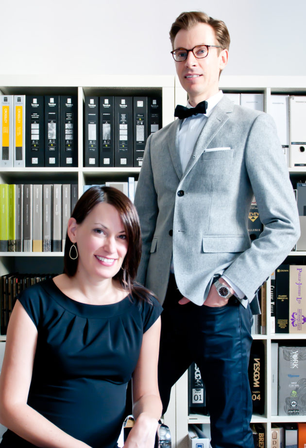
Ryan Martin & Amy Kent – Croma Design
In February of 2007 Echo and I had the opportunity to meet Ryan and Amy, principals of Croma Design at the IDS show in Toronto. That year they had an installation called “Red Riding Hood Residence”. It was a very sexy pad for a modern, chic, and sophisticated young woman.
Ryan and Amy are living proof of what a young and really talented design duo can do. Their design sensibility and their ability to create cool spaces is really inspiring for other young designers like us.
Please see our conversation with Ryan and Amy below.
Iván – What is story behind Croma, How the two of you meet?
Ryan – We met when were both at Cecconi Simone. I was new to the firm when one day the “cool kids” asked me to join them for lunch… of course Amy was one of them. We realized early on that this would work.
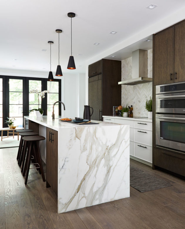
Interiors by Croma Design
Ryan – Amy bakes the cupcakes, I fix the truck. It’s a partnership that works well.
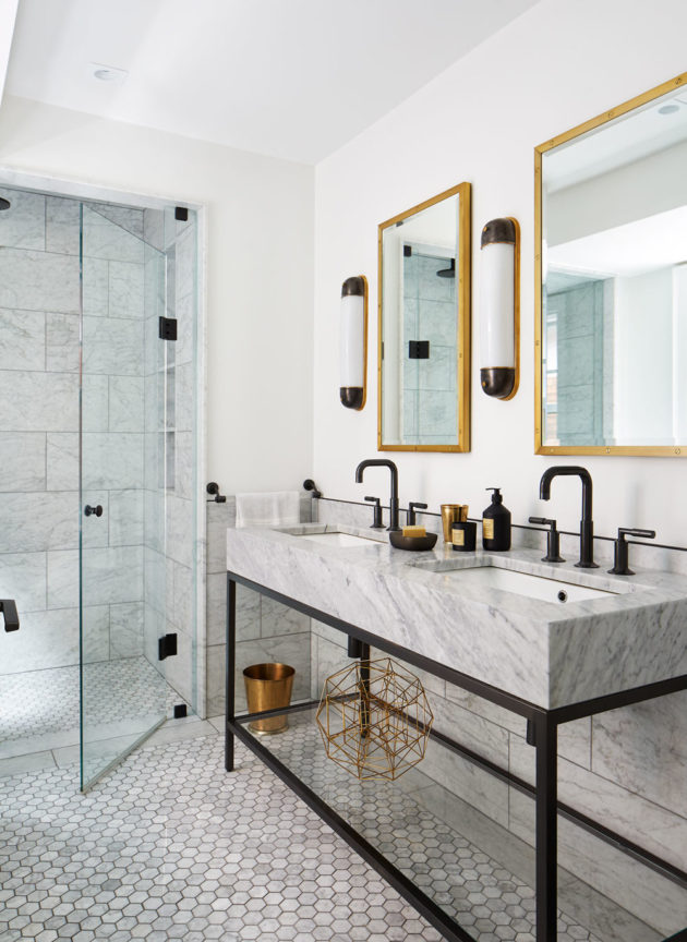
Interiors by Croma Design
Ryan – My strengths? I’m devilishly handsome and smart as a whip. My weaknesses? N/A
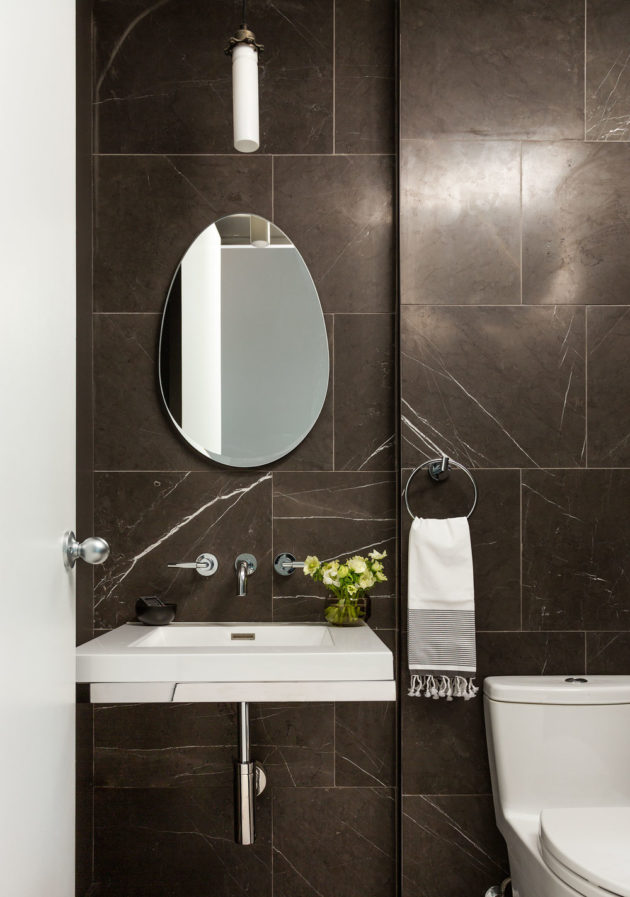
Interiors by Croma Design
Iván – What would you consider to be your partner in design’s strengths and weakness? (meow! – lol)
Amy – Obviously, Ryan is conceited.
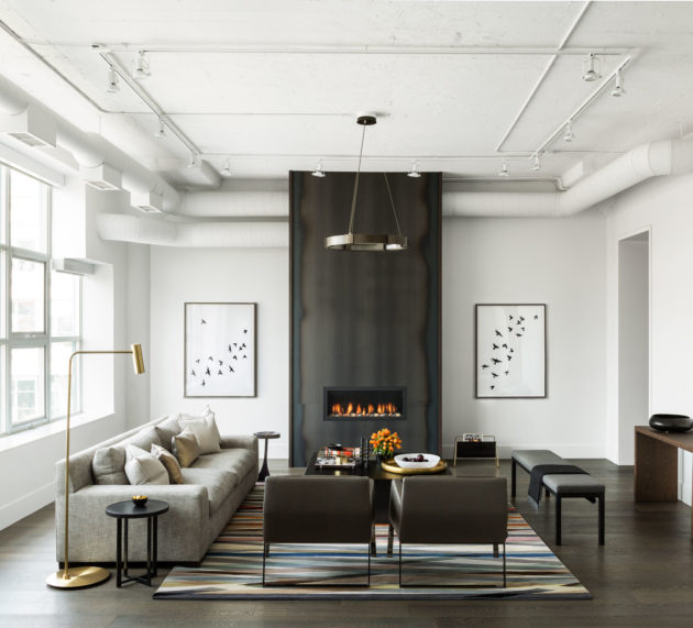
Interiors by Croma Design
Ryan – We were inspired by a theme of “ice”: a crisp white space turned an icy blue by way of theatrical lighting. Overhead, we designed Swarovski chandeliers, which further reinforced the theme of ice as diamonds.
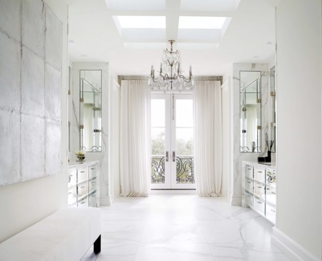
Interiors by Croma Design
Iván – You have been given the opportunity to create unique and creative projects for the IDS for the past 3 years. However, there is always a client to answer to. What would be your dream project given carte blanche with no client to please?
Amy – We actually find that working within difficult parameters tends to make us more creative. However, our dream project would definitely be to design a luxury hotel.
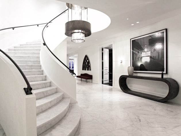
Iván – How would you describe your own living spaces? Being a designer, I know this is the project that is always being bumped down to the end of the list.
Amy – “Light”
Ryan – “Dark”
Iván – Do you have any collections, if so what?
Ryan – I have a variety of cameras which have been collected through several generations of family. My favourite is an Edwardian era collapsible Ensign that belonged to my great grandmother. I have photos of her as a young woman holding this camera.
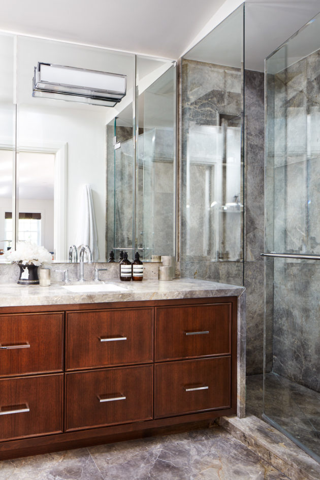
Interiors by Croma Design
Iván – Who or what has influenced your personal design style?
Amy – For both of us, I think it was growing up in a rural environment. There is no more perfect design than that found in nature. I think you develop a sense for recognizing beauty in the built world if you have an appreciation for design in the natural world.
Iván – What was the first experience that you had with design?
Amy – Strangely enough we had very similar first experiences with design. We both discovered builders home plan magazines as kids and of course, re-planned the layouts of all the houses.
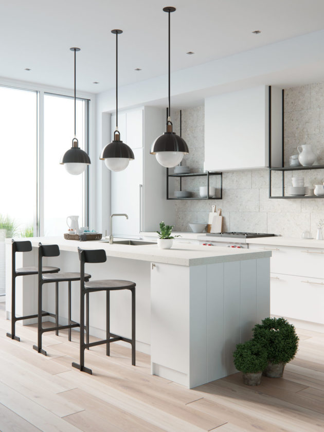
Iván – Looking over your work in the media and in recent publications one can see that you really have a great eye for creating spaces that have beautiful symmetry and scale, are calming and livable, yet you always involve elements that are completely unexpected but blend in perfectly. They just work without looking like you tried too hard. What is your recipe for impeccable taste? In other words, what are the design elements or principles you ensure are included in every room you design?
Ryan – Our biggest priority when it comes to designing a space is the layout – if a room is laid out poorly it just won’t work no matter how good it looks. Additionally, we have an appreciation for simplicity, and a respect for materials – we’d rather let a finish be true to itself than to disguise it as something else. With everything we do, we try to avoid trends and always work on letting the Client’s personality shine through.
Iván – For the home owners that are reading the blog where would you recommend they invest their money to create the biggest impact on their space?
Amy – If you invest in one key quality piece whether it be a stunning Kitchen, Art, beautiful window coverings, or an Italian sofa; this can elevate the impression of the entire space.
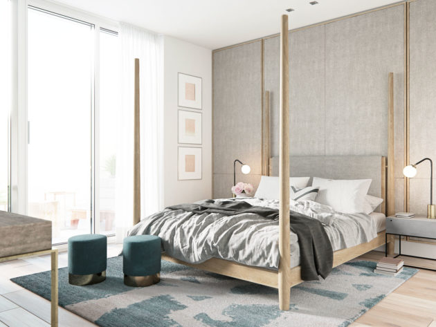
Iván – What has been the most unusual request from a client?
Ryan – We have a great client who has a strong affection for his dog, and wanted a balcony built exclusively for him. It actually turned out to be a great outdoor space!
Iván – Lastly, if you could share one piece of advice or a lesson from your experiences to our readers, what would it be?
Amy – Listen to your instincts. Choose things that you love, or that reflect your personality.
To see more of Croma Designs stunning work please visit:
![]()


Comments
3 Responses to “In Conversation with Croma Design”
love the use of mobiles to fill the volume of space…especially the wood ones in the first few pics.
Great entry, these two are so much fun! I also think the story about Ryan’s camera collection is really interesting.
Stunning work
the GE pictures are really nice