
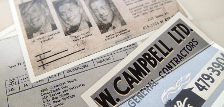
Campbell Construction Ltd. was established in 1964, and has been a Victoria institution ever since. Their solid craftsmanship serves as the foundation of their success, so when they approached Meade Design Group for a reinvigoration of their aging logo, a keen eye for detail and a respect for their history was required. This project truly is a case study in logo redesign.
Original Logo Received From Client
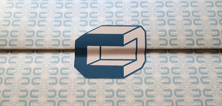
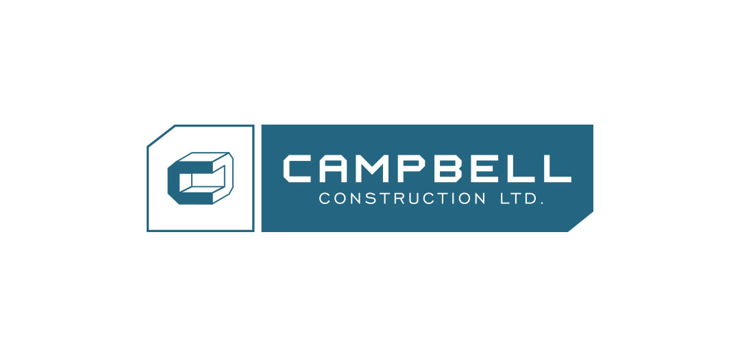
Meade Design Group Revamped Logo
Rather than pairing the logomark with just any typographic solution, a font was designed from scratch to match the angular and precise nature of the company’s classic cubic C. Both elements were then placed within a strong framework to bring them together, yet still allow them to stand fully on their own.
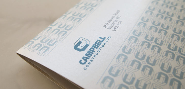
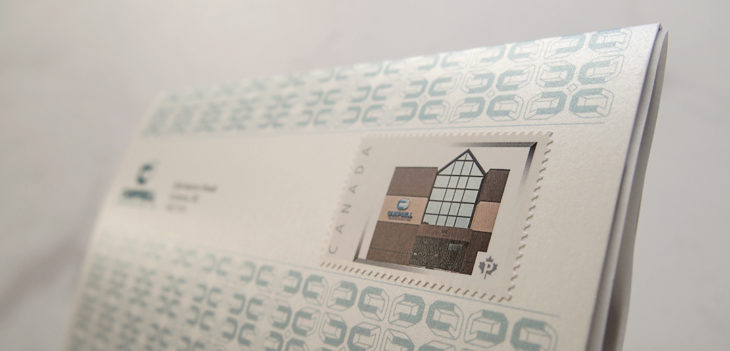
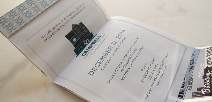
Of course, with a new logo comes new print goods. And in this case, a celebration of the company’s 50 years in business which required a very special invitation.


Comments