There are magazine covers that are so memorable that they stick in your head forever, and this was the case with an issue of a Canadian House and Home on March 2002. The exact same month and the same year I officially started Meade Design Group in Victoria, BC Canada.
When I saw the stunning work of Vancouver interior designers Ian McLeod and Kerry Johnson for the first time I wondered if I had what it takes to pursue a career in interior design. That cover with an asymmetrical placement of 4 perfect square orange and yellow abstract paintings, a traditional freshly painted white mantle, white walls and a round concave mirror with an exquisite white frame inspired some of my first projects. Clean, fresh, simple and unexpectedly sophisticated; the work of this design duo has been on my mind ever since.
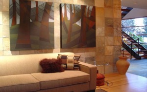
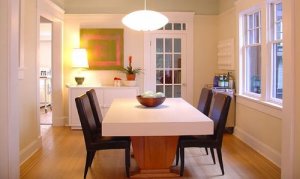
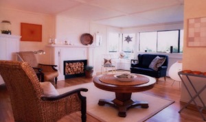
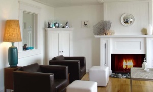
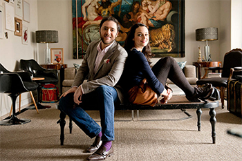
Ian McLeod and Kerry Johnson have been designing home and business environments for over 12 years. Their projects have ranged from eclectic Yale town law firms to sleek urban apartments, as well as the respectful restoration of historic houses. Johnson and McLeod Design Consultants work emphasizes clean-lines, good proportions and quality materials and craftsmanship.
Iván Meade – What was your first experience with design?
Ian McLeod – Making a playhouse out of a big cardboard box when I was about 6. I remember thinking that the box had a ton of potential as a private space.
Kerry Johnson – It sound trite, but my earliest memory is making the perfect house with those rubbery toy red bricks. I guess the writing was on the wall.
Iván – Your interiors are not just beautiful and contemporary but they are also very livable. How do you achieve that?
Ian – We lay out and draw every detail of our work, as much for ourselves as for our clients. That process fixes the spaces in our minds, and tells us early-on weather the design provides visual coherence and good spatial flow for easy movement. We also shun surface materials that can’t take a beating. Why fear your home?
Kerry – When planning layouts or altering floor plans, I always start with what is most practical, and what will allow maximum usage. Once those decisions have been made, we are free to add more decorative elements that create the sumptuous atmosphere that our clients crave.
Iván – I have noticed that in your interiors you paint the wood paneling with a crisp coat of white paint and this has become one of your signature styles. I definitely agree in painting wood paneling because the change leads to a cleaner, brighter, and more elegant room. However, designer to designer, I just have to ask this question– How do you convince your male clients to paint the wood paneling?
Ian – That’s a hilarious question, because it comes up so often. Men love natural wood. Women prefer to paint it all out. The truth is that most of the woodwork we design for our projects is built from ‘paint grade’ materials, which removes the need for reverential treatment. We reserve high-quality woods for use in floors and furniture.
Kerry – That is a great question. We’ve waged some pretty major campaigns to convince the husband that not all wood work is sanctified. Luckily, we do a lot of our work in contemporary structures that don’t have any of these elements, so that when they are added, we can do so with paint grade lumber and mill work. It’s a compliment to us that you think some of these wooden interior details are vintage, when in fact they are brand new.
Iván – Talking about signature styles, one of the most clever things I have learned from your work is what I call the glass phone booth effect. I remember being surprised and impressed the first time I saw this architectural detail in one of your published projects in House and Home. How did you come up with this concept?
Ian – We invented it to create transparent separation between 2 spaces in our apartment. It defines a vestibule, yet preserves long sight-lines and allows for good light in either direction. We have since expanded on the phone booth idea many times. We also love the feeling that French doors add to a space, and it’s a great way to use them.
Kerry – Again, this decision was borne out of practicality. We were working on a media room that was accessed by a stairwell to the main rooms upstairs. Our first requirement was how to come up with a way to keep the sound downstairs. We didn’t want to darken the room with solid walls, so it seemed that the answer was to use glass. It’s a perfect example how something that had to be practical, actually ended up enhancing the look of the room.
Iván – I believe one of your strengths is styling; your vignettes are always exquisitely well done –Any words of styling wisdom? Where do you get your inspiration?
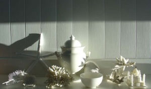
Ian – I’ve been obsessively collecting and grouping objects all my life. I’ve come to think of it as temporary sculpture or 3D collage. It’s all about creating balance and contrast with a group of assembled forms. There’s usually a unifying element to the grouping in terms of color, shape or subject matter. I might gather and group blue glass, primitive wooden animals, or things that are all in shades of white. Styling is a temporary art form, and that’s part of the fun.
Kerry – We’ve always been magpies, and have cupboards and cabinets brimming with objects that we’ve collected all over the world. Our current faves are a set of silver articulated fish that we found in Siem Reap, while touring Angkor Watt. A good friend of ours refers to the constant re-arranging of objects as Chachkas Chess. We’re always on the look out for things that sit outside of the ordinary. When displaying these objects, the basic rules of yin and yang apply…place something tall next to something squat, arrange things in threes, keep color and texture in mind, and if you’re looking for inspiration, take a look at any European magazine…Marie Claire, World of Interiors…they just seem to have a knack for this sort of thing.
Iván – I noticed that you always use beautiful contemporary art in your projects. While researching for this interview I discovered that Ian is the artist for some of that art. Ian, I have to say you are a master in colour theory and composition – How long have you been painting?
Ian – I’ve been drawing and painting since I could hold pencils and brushes. I made my living as an illustrator and painter long before Kerry and I developed our design business, and having a background in art helps with the design process in many ways.
Iván – Continuing along the topic of art, I am curious to know if you select art pieces to work with a room or if it is it the art that inspires the design of the space?
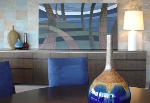
Ian – We have a very open mind about art, and tour local galleries and websites regularly. The art we choose must work well within the completed space, but we try to create rooms that are spare and gallery-like enough to receive an eclectic assortment of art, and allow it to breath.
Kerry – Generally I defer to Ian when it comes to art work, though we have worked on a few custom pieces together for specific sites.
Iván – My research also reveals that you both are published writers. Kerry, your articles for the Georgia Straight are full of humour, but also reveal an honest concern regarding what is happening in your surroundings – Do you feel especially attuned to the changes in your surroundings?
Kerry – When something new arrives in the house, it’s a bit like introducing a new sibling to the family. It informs everything else, and can have a domino effect to the point where the whole place needs to be restyled. We can’t live in a place without visual Harmony.
Ivan – I still remember the front cover of the House and Home where your condo was featured. The blues and oranges of the square paintings made a very strong impression. I noticed today in your portfolio that your place has changed completely. The architectural details remain, but the furnishings and the rest of the elements have been updated. How often do you change the decor in your own place?
Ian – As the seasons change, we change the art and objects in our environment. I crave the coolness of whites and blues and transparency in the summer. I crave the warmth of gold, orange and red tones in the fall. Our place makes a great design-lab for such change, as it is all pure-white. Rooms based on a white or neutral palette are the ideal place to make low-commitment changes at whim.
Kerry – Hourly…I know that may sound crazy, but the tweaking never stops. This is a labour of love, so it’s a source of enjoyment for us to play constantly with the interior. The basic structure of the house remains much the same, but the furniture, lamps, artwork and lamps are in high rotation. Then of course, there are wholesale seasonal changes that have to be made. Carpets come up for the summer, and go down in the fall, that sort of thing.
Iván – What is next on your design journey?
Ian – This winter’s roster of design work includes residential projects in Maui and Antigua, which is very exciting. We are also designing a large, family-compound in the gulf islands and will be the architects, as well as the interior and exterior designers. It’s a big challenge, but a great opportunity for us to work without parameters, which is very rare
Kerry – This is a very exciting time for us, as we’ve been commissioned to plan our first house from the ground up. This has always been a dream for us. Our clients have signed off on the initial drawings, and after years of trying to fix and alter compromised places, it’s a joy to start with no restrictions. The architecture of a house is very important, and it’s a thrill to start with a clean slate.
Iván – Lastly, you have already created a stunning body of work with many mediums and styles. What would you like your legacy to be?
Ian – That is very kind of you Ivan. We just keep working on each project in a consistent effort to create lasting elegance and value. There really is too much waste in the name of fashion. Things that make sense from a practical and aesthetic point of view don’t date easily. I’m proud that many years after we’ve designed a space, a new coat of paint and a change of sofa are often all it takes to bring it right up to date again. If you get the spaces and the lighting right, there’s no need to keep tearing it all down.
Kerry – I’d like to think that we’ve helped people maximize the potential of their homes, and that at the end of the day they get to live in a home that inspires them every day.
To see more of Ian McLeod and Kerry Johnson stunning work please visit:



Comments
4 Responses to “In Conversation with Johnson & McLeod Design Consultants”
Great interview Ivan.
It is always nice to see how different artists think.
What a great interview!
And I love th Johnson and McLeod style, elegant yet casual and contemporary.
I look forward to more!
They are very media saavy, and do amazing work…thanks for the great interview.
Amazing photos. I really love what I see. Great interview too.
Deirdre G